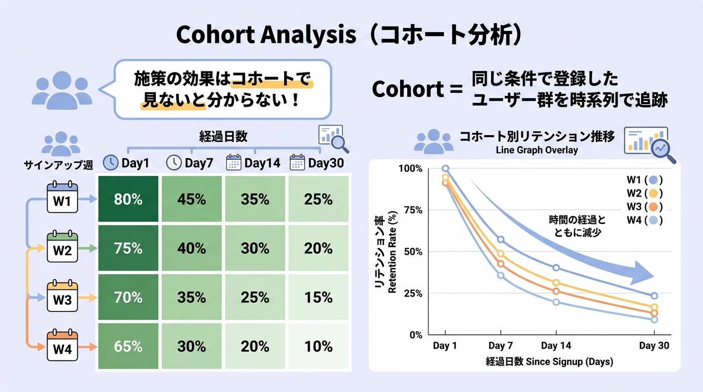


Why slice by cohort
Marsh
I've heard "cohort analysis" thrown around — how is it different from regular retention reporting?
Mallow
It separates timing effects. When "D7 dropped last month," was it because of your update or because that month's traffic came from a low-quality paid source? A flat retention chart can't tell you. By cohort, you can compare people who arrived in the same window, so changes you shipped show up cleanly.
Marsh
How do you define a cohort?
Mallow
Usually by first-visit week or month. "Players who first played in 2026-W01" is one cohort; you track their D1, D7, D30 over time. The display is a triangle table: cohorts on the rows, days elapsed on the columns, retention in each cell.
Marsh
In that table, what am I looking for?
Mallow
Compare cohorts top-to-bottom in the same "days elapsed" column. If post-update cohorts show higher D7 than pre-update ones, your change worked. To isolate channels, build a separate table for "paid cohorts" vs "organic cohorts." The flexibility of the slice is the whole point.
Marsh
How small can a cohort be before the numbers get noisy?
Mallow
Practical floor is around 500 users per cohort. Below that, week-to-week swings start to look like change when they're just sampling noise. Brand experiences often need to roll up to monthly cohorts because weekly traffic is too thin.
Formula & benchmarks
Cohort retention[c, d] = Users from cohort c active on day d ÷ Cohort c size
- Per-cohort floor: Aim for ≥500 first-visit users for stable reads; ≥2,000 for confident A/B comparisons
- Window cadence: Weekly cohorts for live ops, monthly cohorts for strategy reviews
- Healthy curve shape: Steep D0→D1 drop, then a flatter tail. A long flat tail is the goal
Worked example
Marsh
Say we have this:
Mallow
Let's read this together.
Cohort | D0 | D1 | D7 | D14 | D30
2026 W01 |100% | 35% | 12% | 8% | 4%
2026 W02 |100% | 38% | 14% | 9% | 5%
2026 W03 |100% | 42% | 16% | 11% | —
2026 W04 |100% | 45% | — | — | —
2026 W01 |100% | 35% | 12% | 8% | 4%
2026 W02 |100% | 38% | 14% | 9% | 5%
2026 W03 |100% | 42% | 16% | 11% | —
2026 W04 |100% | 45% | — | — | —
Marsh
D1 is climbing — 35 → 38 → 42 → 45. So whatever we shipped is working?
Mallow
Looks that way. But two checks first. (1) Did the traffic mix change? If W03 onward was driven by a higher-quality organic surge, that explains the lift without any product change. (2) Cohort sizes — if W04 has only 200 users, the 45% is noisy. Build a second table sliced by traffic source and re-read.
Marsh
So the table is only the first read. Conclusions need another slice.
Mallow
Always. Cohort analysis layers up — that's the whole craft.
Reading it in Roblox
Roblox Creator Hub’s Analytics tab gives basic retention by date but doesn’t expose the full cohort triangle directly. For a real cohort table you usually need to (a) export DAU/play events via Roblox’s Open Cloud APIs and build the cohort table yourself in a spreadsheet or BI tool, or (b) use external analytics like RoMonitor or PlayFab. For brand experiences with modest DAU, a weekly cohort spreadsheet maintained by hand is often the realistic minimum.
Common misconceptions
- "D7 dropped this month" doesn't necessarily mean the product got worse: A new acquisition channel can drag the average down without any cohort actually changing. Cohort-by-cohort confirms the cause.
- Small cohorts produce false signals: Below ~500 users, retention swings of a few points are noise. Don't ship a fix based on a 200-person cohort.
- Cohorts aren't only about retention: ARPDAU by cohort, payer-share by cohort, and session length by cohort all tell different stories. The technique generalizes.
Related metrics
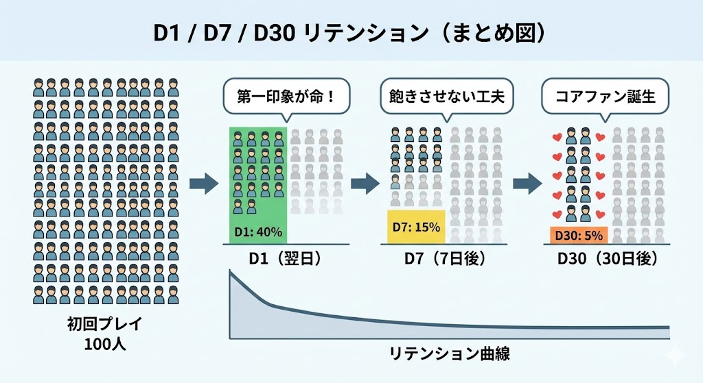
- Day 1 / 7 / 30 Retention: The cell values in the table
- LTV: Per-cohort LTV exposes which month's intake had the best monetization
- A/B testing: Treatment vs control groups are themselves cohorts
- Churn Rate: Compounded churn per cohort is the cleanest way to read decay